I AM A

We Make You Smile

Easter Baking : Raspberry Chocolate Chip Plant-Based Cookies

yum, diyI AM AComment

Every bank holiday, or long weekend we like to do a spot of baking. Especially getting up early as we like to both celebrate that it’s holiday (wahey!), and finally we have time to try out some of the recipes that have been earmarked for a while. This moorish recipe we came across is from Deliciously Ella, a plant-based recipe that is super delicious. We have altered the recipe as we love the combination of sea salt and dark chocolate, and a more chocolatey frosting.

Last Easter, our DIY craft was based on eggs, faux chocolate Easter eggs, hee hee. This Easter, let’s have some real chocolate! During this time of the year we definitely would have chocolate (quite a lot!) lying around.

Nothing beats a warm chocolate cookie! Yum!

Easy dark chocolate chip raspberry vegan cookies deliciously ella

Raspberry Dark Chocolate Chip Plant-Based Cookie Recipe

(Adapted from Deliciously Ella)

Ingredients:

Cookie Recipe

200g Almond Flour

100ml maple syrup

4 tablespoons of brown rice flour

1 teaspoon of baking soda

1 tablespoon of coconut oil, melted

1 pinch of sea salt

100g dark chocolate broken into shards ( 70% dark chocolate)*

Raspberry Dark Chocolate Frosting Recipe

125g fresh raspberries

100g dark chocolate ( 70% dark chocolate )*

1 tablespoon maple syrup

Method:

  1. Pre-heat oven to 160 degree fan

  2. Put all the ingredients into a blender (except dark chocolate chips) and pulse until all the ingredients are combined. Add in the broken chocolate shards and pulse until everything is mixed well. If you’d prefer finer more even chocolate chips, chop them up before hand, however, we like uneven bits of large chocolate chips. We just broke up the chocolate into different shapes.

  3. Empty contents from blender and using a tablespoon to scoop out a spoonful of mixture and roll them into balls. Flatten them on the baking tray with your thumbs.

  4. Bake for about 15 - 20 minutes until golden and brown.

  5. Meanwhile whilst the cookies are cooling, add the raspberry frosting ingredients into a pan. Using medium low heat melt everything, crushing the raspberries. Once the chocolate has melted, using a hand blender, whizz up the sauce. Drizzle the sauce over the chocolate.

  6. Indulge the warm cookie! We love it with a cup of coffee! Or top it with a scoop of nice cream “plant-based ice-cream” or any ice-cream you have for a lovely treat.

*It’s a really good way to use up any chocolate you have lying around after Easter! Easy recipe to make with children.

Happy baking! Most importantly, happy devouring!
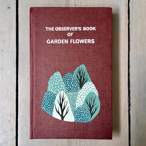
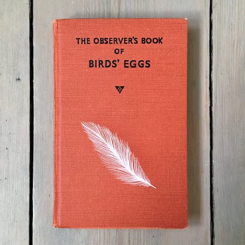
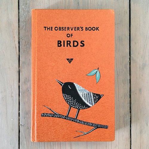
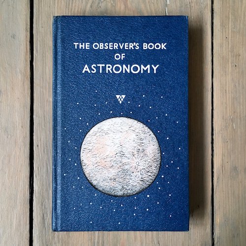
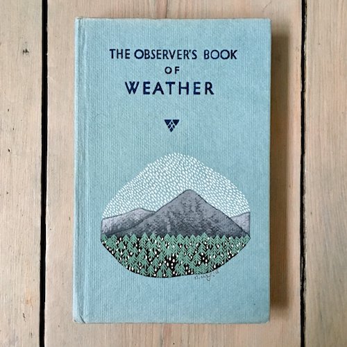
Super cute illustrations on The Observer's Books

illustration, sweetI AM AComment

The Observer’s Books that are a wanted series of vintage books published by the Frederick Warne & Co in the UK from 1937 to 2003. The books cover a large spectrum of topics, from British birds, dogs, cats, caterpillars, astronomy, fishes, house plants, cacti, roses to hobbies including postage stamps, coins, music, British architecture and locations including London, Cotswolds, Devon, Cornwall and Paris. A must have for colour enthusiasts and book lovers.

The series contains 100 titles and are very sort after, both for its vast array of knowledge and the block colour fabric book covers that are great desk and shelfie props, and are frequently seen in styled photography with lifestyle products.

Illustrator Natasha Newton www.natashanewton.com from Suffolk / Surrey has further brought the book series to life, and escalate the books to super cute status by adding her own very pretty modern touch - her original nature / landscape paintings in gouache and acrylic ink to these lovely vintage Observer’s book covers. We agree how Natasha had described her customised book covers as “a work of art” - we HEART these (big time) as it combines our love of books, colour and illustrations.

Playful Cat Lady - Definitely Not Crazy

photography, sweetI AM AComment

Cat lady has a bad press for being crazy people. Nope, definitely not. We love them. It is totes adorbs to have an amazing bond between humans and their caterrific feline companions. This human-pet duo relationship is brilliantly celebrated through the blog / website Girls and The Cat - photographer - Brooklyn based fashion photographer Brianne Wills.

Brianne has photographed and interviewed over 200 cat ladies along with their cats across the United States. The stories are heart warming, as many of the meows were found through rescue and adoption. The posts are super sweet and also give us a glimpse into the decor and bond; cats, humans and decor - love! Here are some of our favourite interviews and cat poses ( the movements of cats have been beautifully captured by Brianne ).
Find out more about Girls and Their Cats on the website https://girlsandtheircats.com

Illustrator Catherine and Cat Edgar, New York

Illustrator Catherine and Cat Edgar, New York

Art gallery manager Liz and Cat Junebug, Philadelphia

Art gallery manager Liz and Cat Junebug, Philadelphia

Graphic designer Ali Kasper and Cat Senator Milk Mann, Portland

Graphic designer Ali Kasper and Cat Senator Milk Mann, Portland

Art Director Gabrielle and Cat Fievel, New York

Art Director Gabrielle and Cat Fievel, New York

Journalist / Editor Jessica and Janetta, New York

Journalist / Editor Jessica and Janetta, New York

Photos courtesy of Girls and Their Cats

Adding Colour To Vintage Photographs and Postcards

colour, paper, artI AM AComment

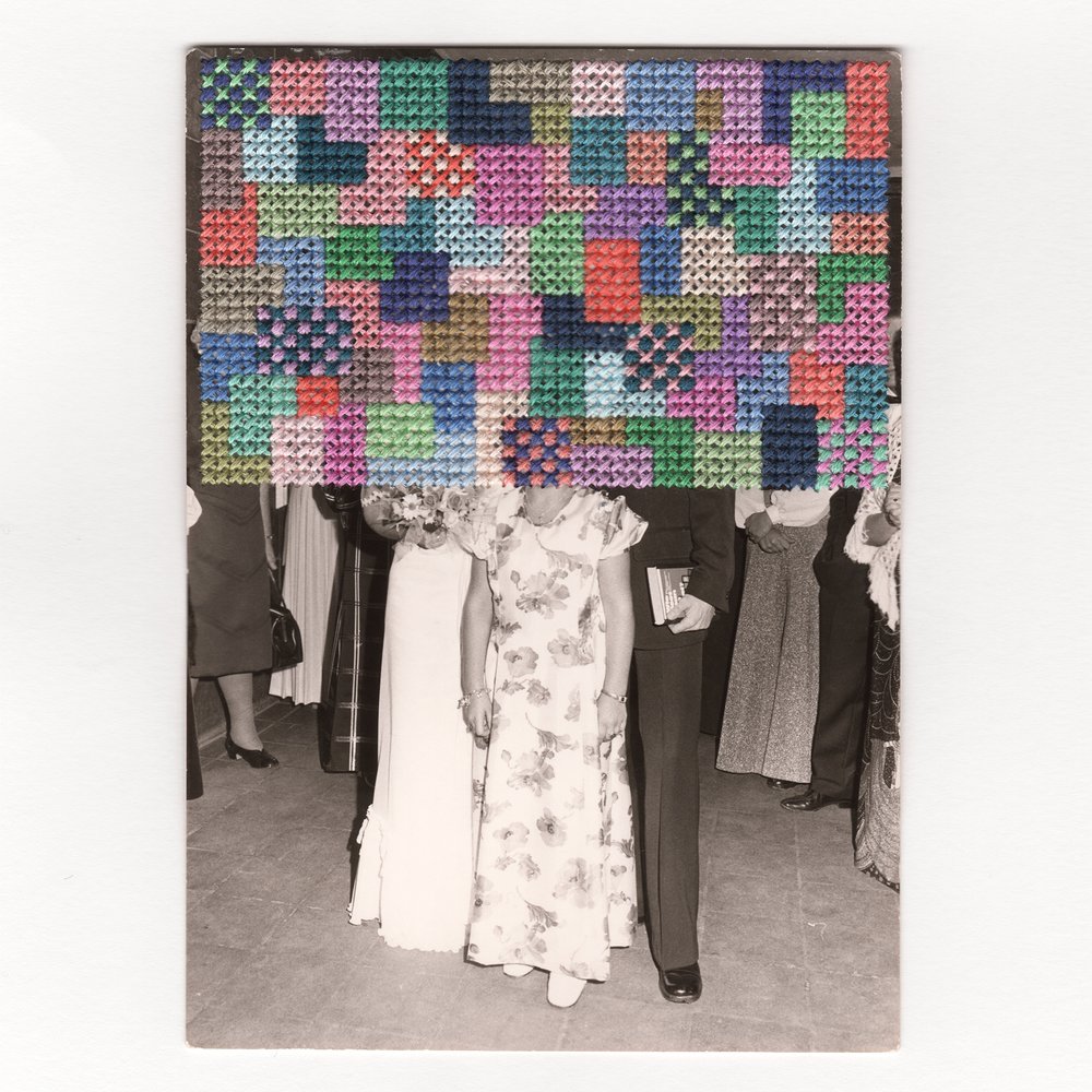
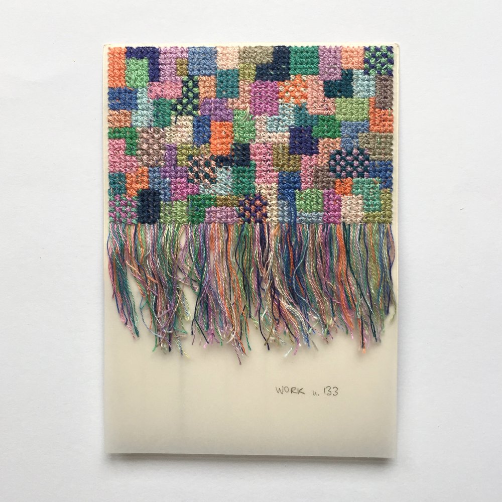
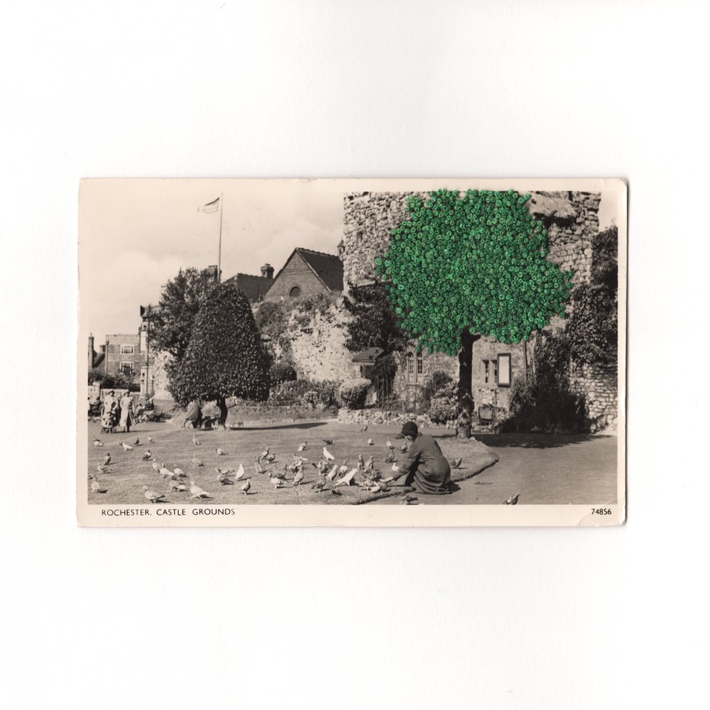
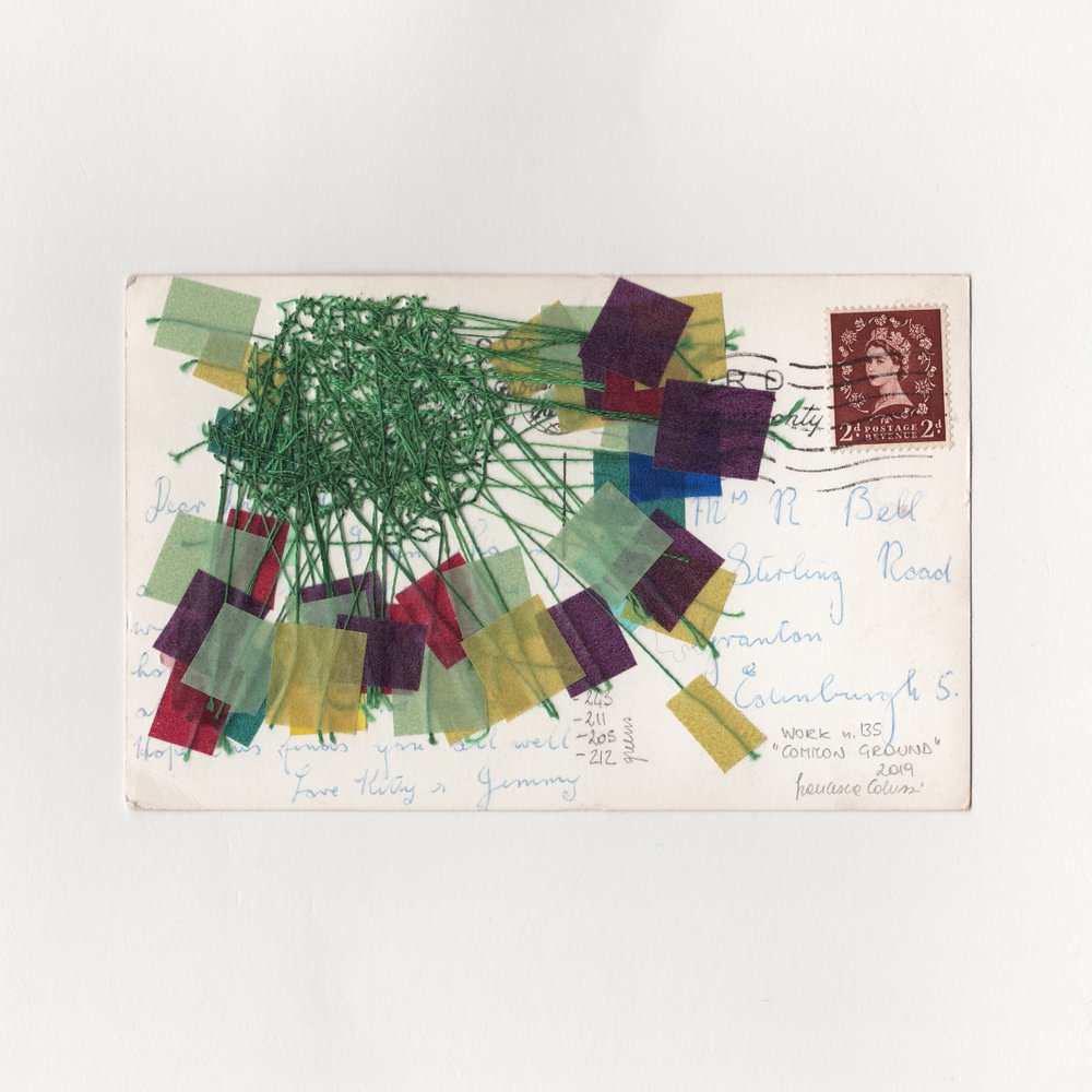
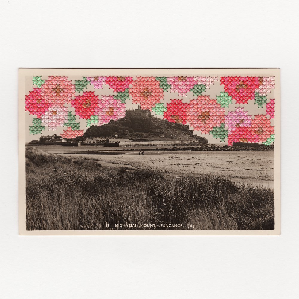
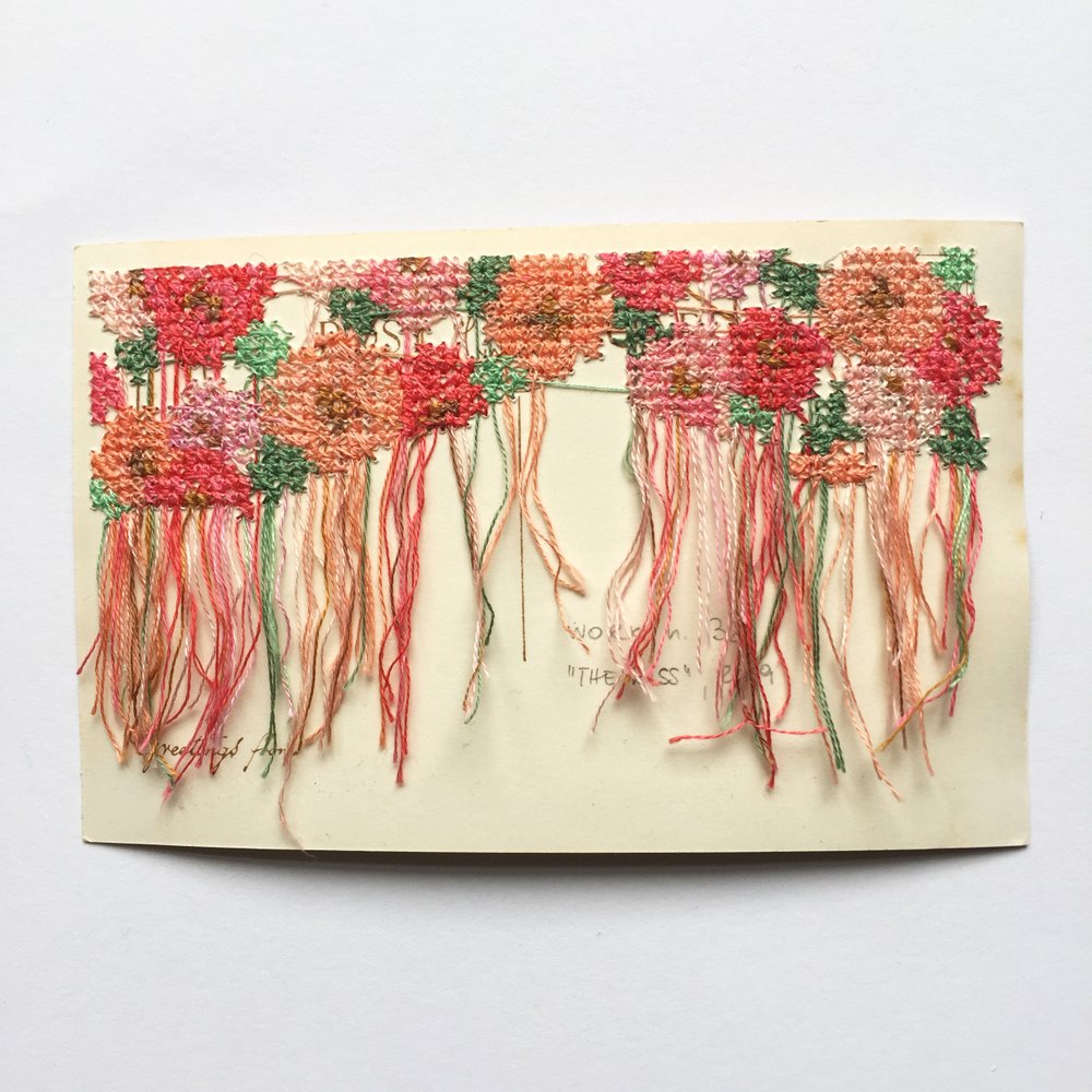
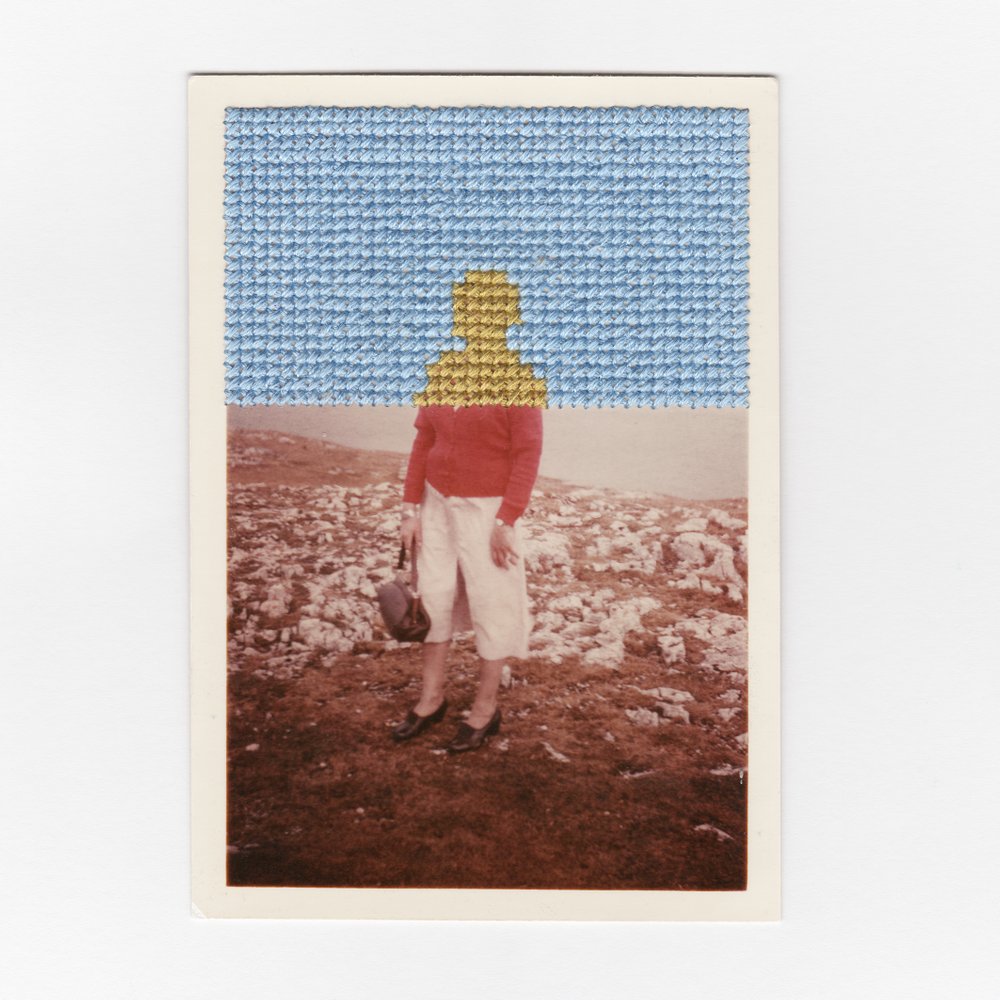
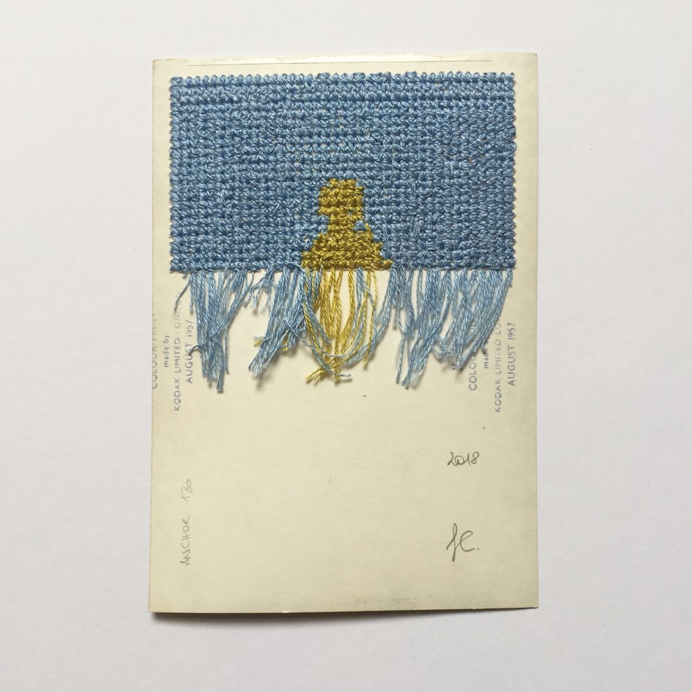
Postcards and photographs always capture memorable times. Especially vintage ones, through time, it adds extra nostalgia. Meet modern embroidery artist Francesca Colussi Cramer, where she would embroider colourful cross stitches to enhance found vintage ephemera, from photographs and including postcards. Not only does the cross stitching add a very modern vibe to it, the stitching and the colours further enhances the depth of the postcard and tells a more rich story.

The vintage photographs and postcards include themes of a wedding, countryside landscapes and portraits.

P.S. We love the details of Francesca’s work, not only the front is beautiful, the back where you can see all the stitches and the thread are sew cool!

Travel in a Wes Anderson Colour Palette

colour, travel, photography, architectureI AM AComment

As avid travellers, we always love to plan our next destination of travel. Thru traveling, it brings us lots of new knowledge, inspirations and memories. We love to travel like a local, learn the lingo, enjoy local food, and bathe in the culture.

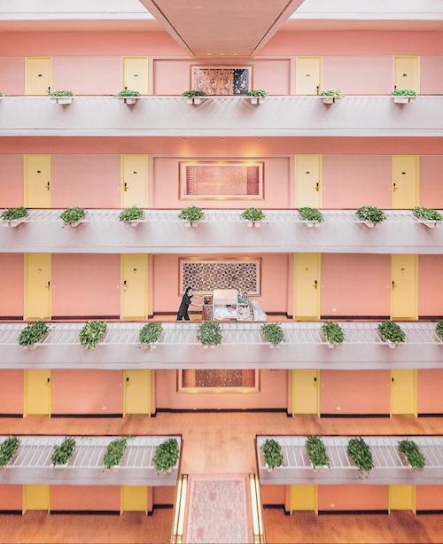
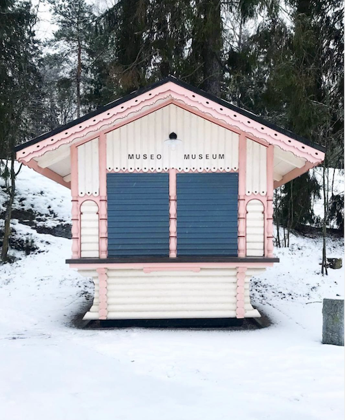
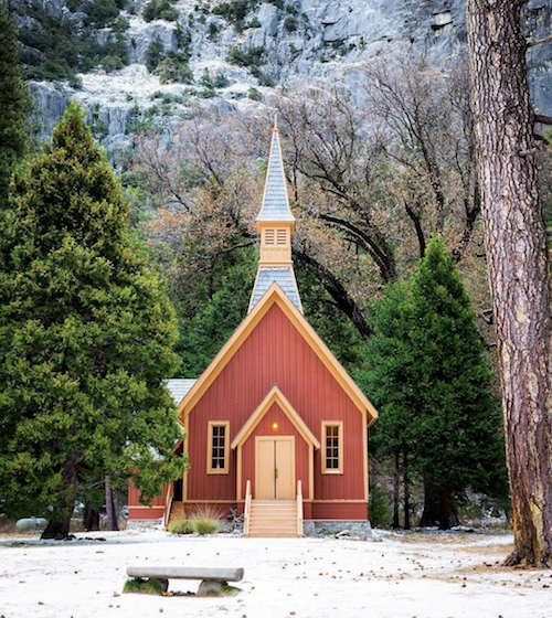
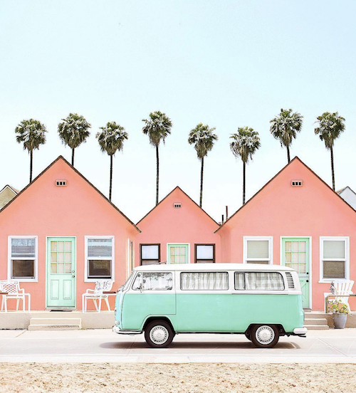
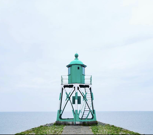
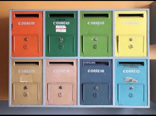
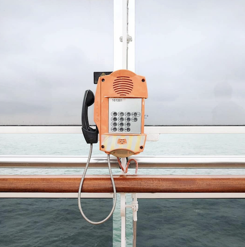
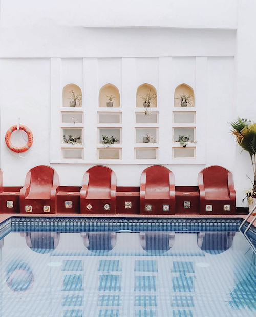
Meet our latest crush: Accidentally Wes Anderson, a website and Instagram account @AccidentallyWesAnderson that hosts pictures from many beautiful travel destinations in a Wes Anderson kind of quirky, colour palette and theme. Many of the pictures collated could just be that scene in a Wes Anderson movie in breathtaking locations from Argentina, North Korea, Taiwan, India, to of course London and Wales! That super cute pastel pink museum Seurasaari Open-Air Museum in Helsinki, oh hello! You are on our bucket list!

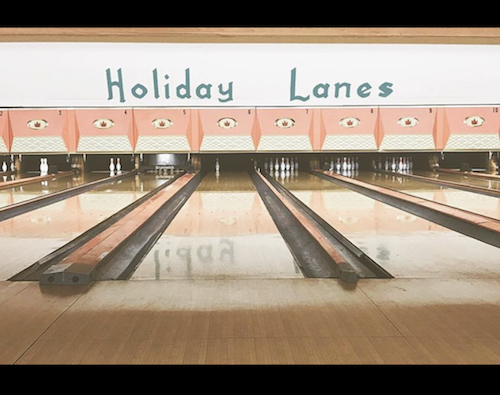
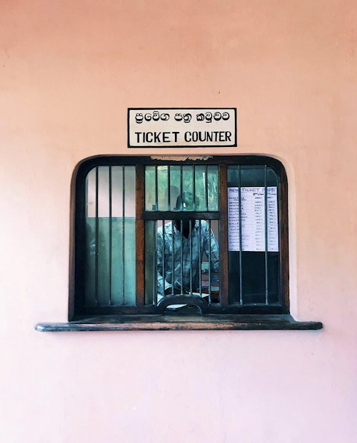
In addition to the beautiful destinations that were photographed by it’s community of travellers from around the world - pictures include buildings, architecture to landscapes, but, this site / instagram account does more than that. The account also captures the cute transportation, from cable cars (Yes very Wes Anderson), train cabins, and also local gems and communal artefacts from phone boxes, fun words and text on buildings, parks, post boxes and ticket counters. Our kind of encounter - in fact this site is our current daydream destination. The colours captured from hues of pastels, pinks, to blues and greens, hints of red, burst of yellow. That’s what we call dreamy!

If you have any pictures from a Wes Anderson-esque holiday, you can also submit your snaps via this link on their website. Snap snap!

Below are some of our favourite pictures (we actually love them all - it’s possible!).

Bon voyage!

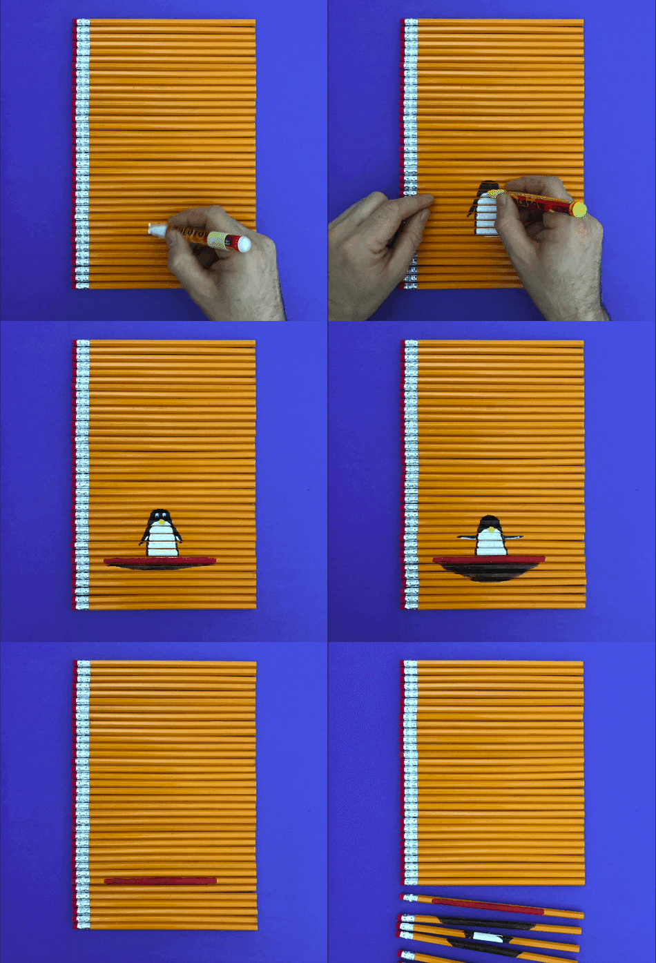
HB Hexagon Pencil Addict

pencilsI AM AComment

Yay! Pencil addict found. It’s lovely to encounter a pencil addict online that shares the same love of hexagon pencils. Hooray! Hello fellow pencil addict!

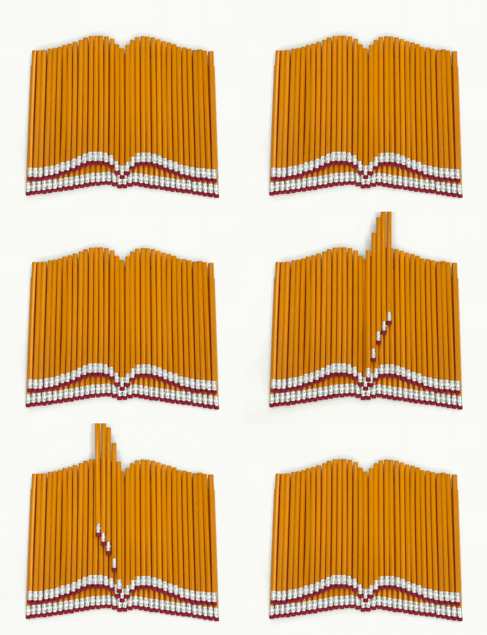
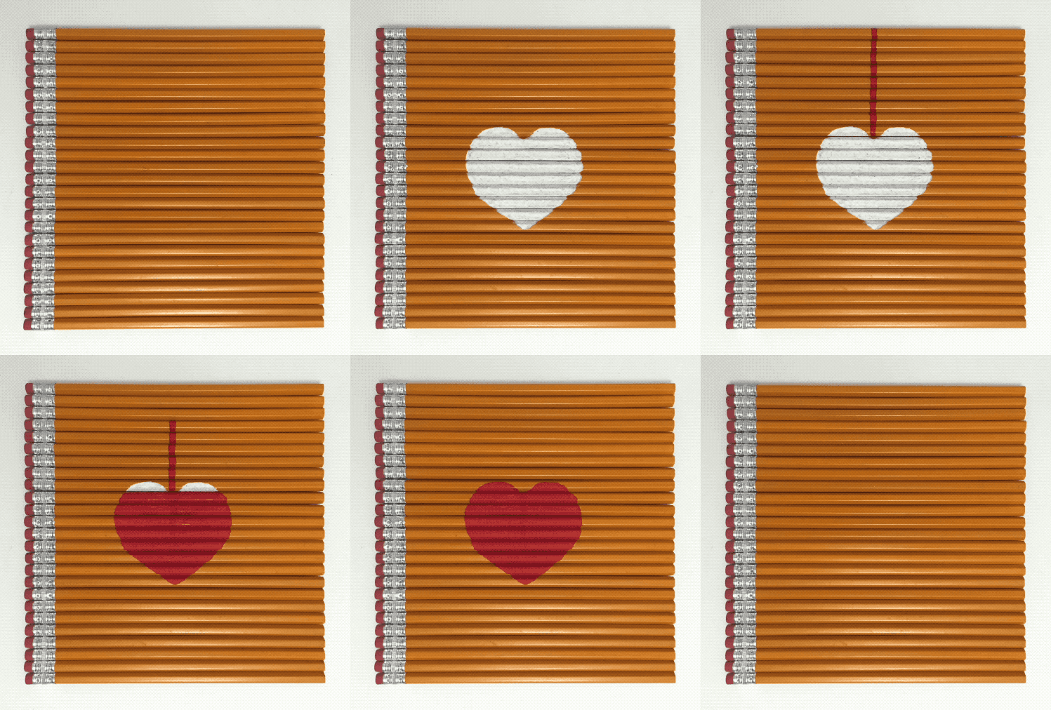
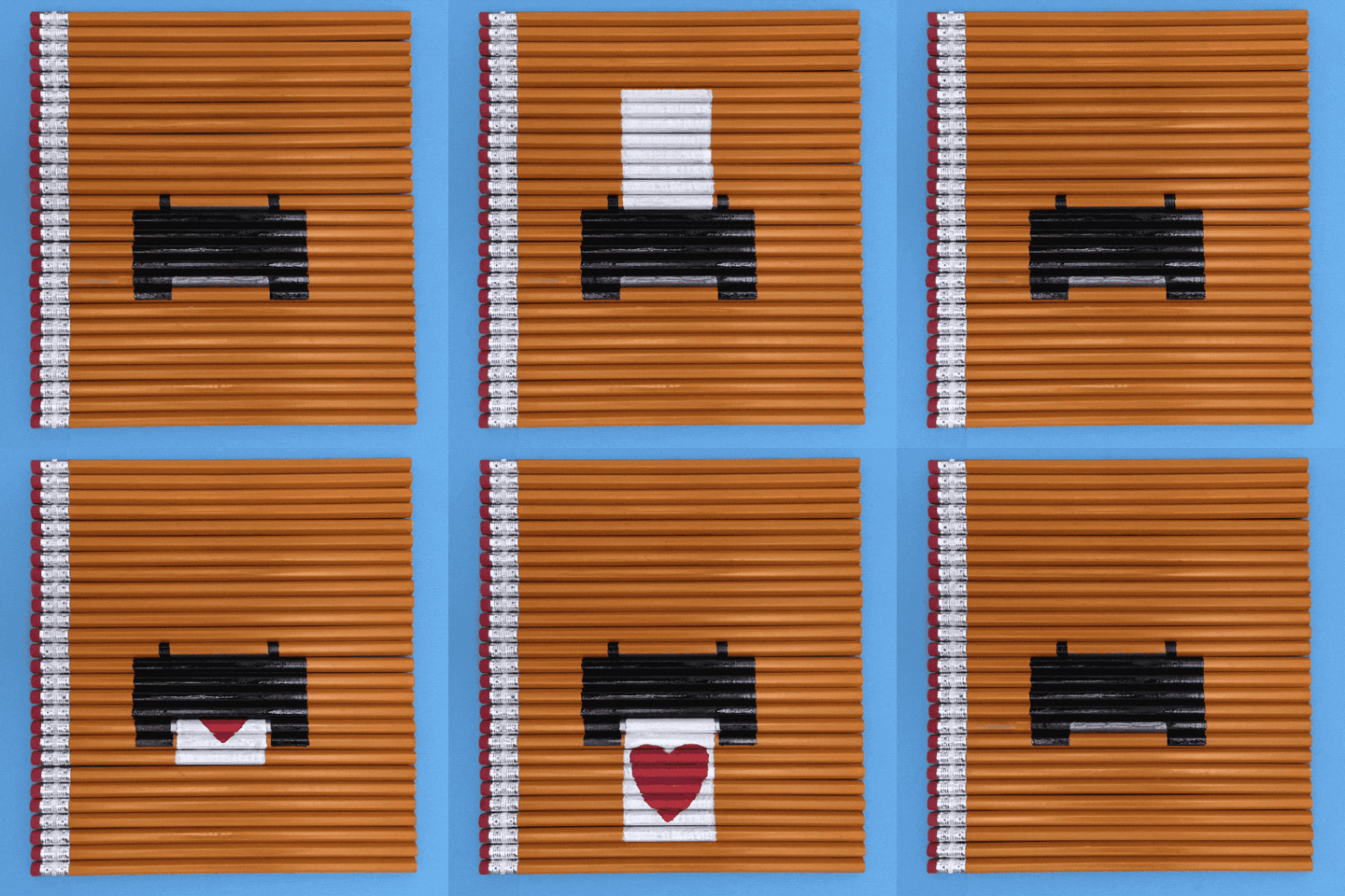
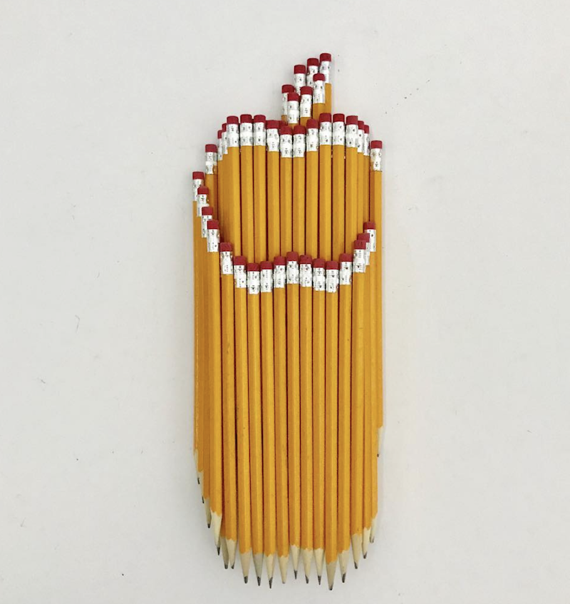
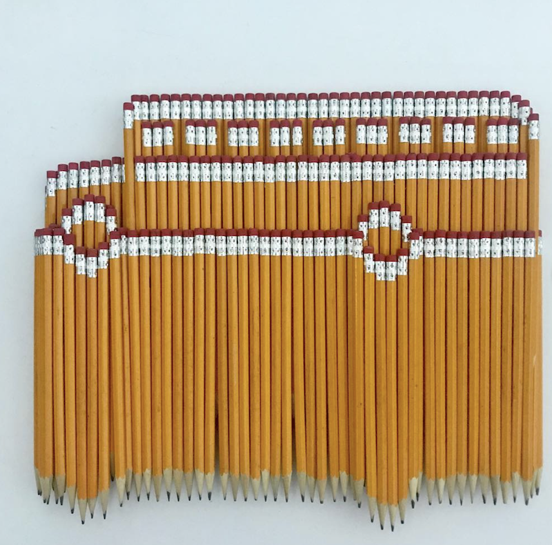
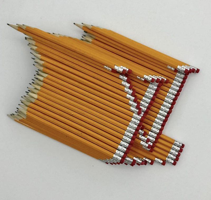
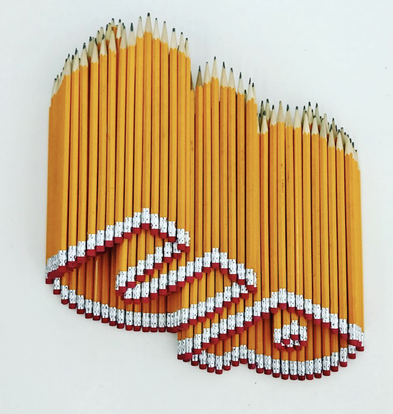
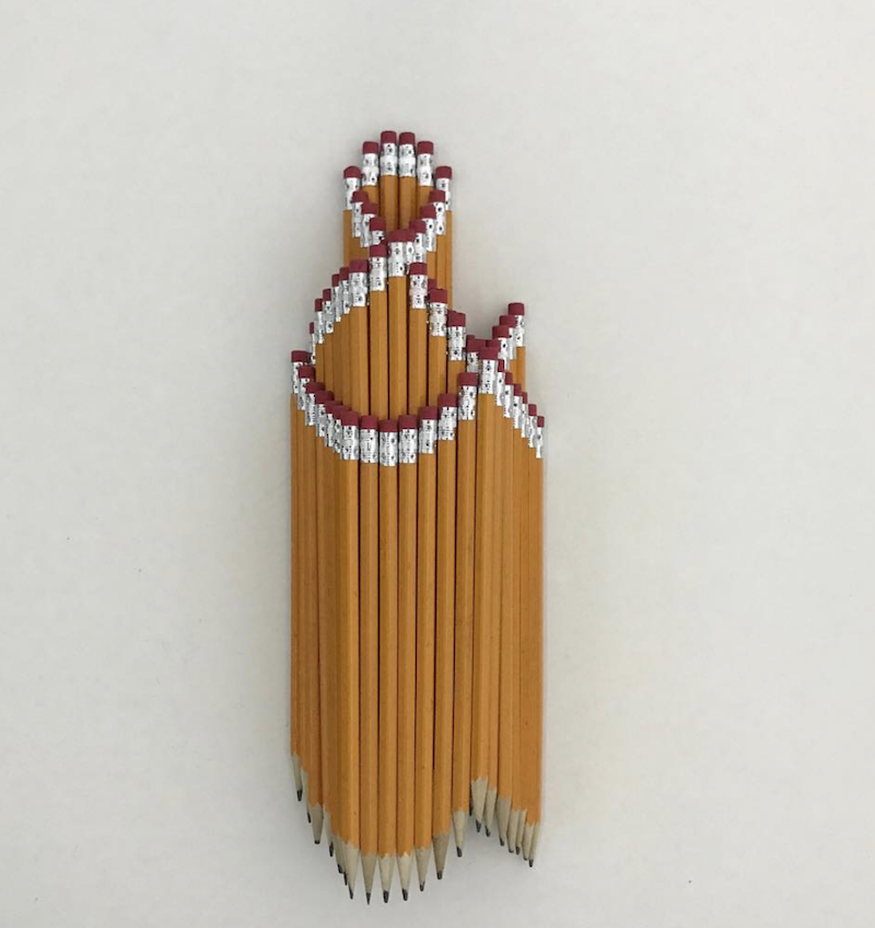
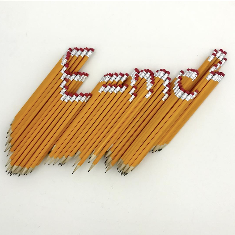
Two days away from National Pencil Day (30th March 2019), one of our favourite national days in the year. We have found artist. Bashir Sultani, who makes cosmic galaxy art with salt on his YouTube channels, but has also been making animated gifs and forming words, shapes, and logos with sharpened yellow HB hexagon pencils on his instagram account.

Hexagon Pencil Animations

Hexagon Pencils Arrangement

Say Period to Period Poverty

design, greeting cards, colourI AM AComment

Period is a regular periodic occurrence in many women’s calendars.

As someone with long and heavy periods, the inconveniences and embarrassing moments a heavy period could bring, feminine hygiene products are a must-have (!) and not a nice-to-have luxury. We know how it feels.

We are long supporters and passionate about the campaign to stop period poverty by regularly donating sanitary products in our local supermarkets.

In a research conducted in 2018, one in ten young women in the UK have been unable to afford sanitary products. This could lead to serious consequences from girls not attending school in addition to inconveniences in day to day life. Not ovaryacting here, it’s important that feminine hygiene products are available across the board as essentials. Over 137,700 children in the UK have missed school as they were not able to afford feminine hygiene products to have access to do. This also means some girls ended up with their own make-shift DIY workarounds which may not be hygienic, let alone traumatic to have to go through it every month to think about solutions to resolve a monthly occurrence.

The idea where girls have to either stay at home due to the inconveniences with the unavailability of sanitary products, feeling awkward and embarrassed, to creating make shift options as alternatives are not acceptable.

We really want to be able to help say Period to Period Poverty. The organisations that have a good support network and outreach of the donation includes:

When we created our “In Few Words” collection of greeting cards. A collection of cards that contains 36 colour coded words including all the spectrum of colours in the colour palette from red to black. With each colour, we have complimentary coloured text. The concept of the greeting cards is to use as few words as possible on each card and express feelings straight to the point. For the colour way maroon, or oxblood we have included the word “Period”.

Period the word has multiple meanings, from meaning end of, the punctuation mark that is same as a full stop, and of course the physiology of the shedding of the uterus lining.

This card provides multiple conversation starters from end of an era, and moving onto new adventures, relationships, jobs to supporting a good cause to end period poverty.

Beyond International Women’s Day, for each card purchased, we are committed to donate 50p donation to help combat Period Poverty by contributing to the above mentioned charities. Let’s say PERIOD - to period poverty! Pick up you PERIOD card here and help spread the word to end period poverty!